Overview: With the use of HTML and CSS, we'll design a giant menu step by step in this tutorial.
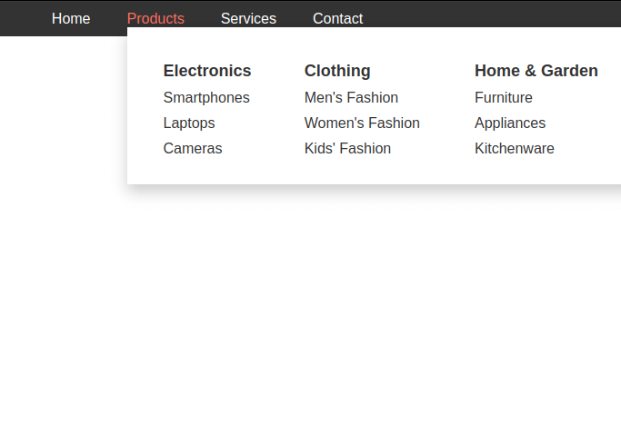
A mega menu provides a visually appealing and organized way to present a lot of content without overwhelming the user.Websites with several categories, subcategories, and choices frequently use mega menus as a navigational tool.We'll go through how to make a giant menu with HTML and CSS in this article.
Step 1: Setting Up the HTML Structure
To start, create a new HTML file and set up the basic structure. We'll create a navigation bar with a mega menu dropdown.
<nav class="menu">
        <ul class="menulist">
            <li><a href="#">Home</a></li>
            <li class="mega-dropdown">
                <a href="#">Products</a>
                <div class="mega-menu">
                    <div class="mega-menu-content">
                        <div class="product-category">
                            <h3>Electronics</h3>
                            <ul>
                                <li><a href="#">Smartphones</a></li>
                                <li><a href="#">Laptops</a></li>
                                <li><a href="#">Cameras</a></li>

                            </ul>
                        </div>
                        <div class="product-category">
                            <h3>Clothing</h3>
                            <ul>
                                <li><a href="#">Men's Fashion</a></li>
                                <li><a href="#">Women's Fashion</a></li>
                                <li><a href="#">Kids' Fashion</a></li>
                            </ul>
                        </div>
                        <div class="product-category">
                            <h3>Home & Garden</h3>
                            <ul>
                                <li><a href="#">Furniture</a></li>
                                <li><a href="#">Appliances</a></li>
                                <li><a href="#">Kitchenware</a></li>
                            </ul>
                        </div>
                    </div>
                </div>
            </li>
            <li><a href="#">Services</a></li>
            <li><a href="#">Contact</a></li>
        </ul>
    </nav>
Explanation:
- The <nav> element represents the navigation bar.
- Inside the navigation bar, we have an unordered list <ul> with list items <li>. Each list item contains an anchor <a> tag that represents a menu item.
- The "Products" menu item has a class "mega-dropdown" to indicate that it has a mega menu.
- The mega menu itself is contained within a <div> element with the class "mega-menu".
- Inside the mega menu, we have a container with the class "mega-menu-content".
- Within the "mega-menu-content", we define three product categories, each with a title <h3> and an unordered list of product links.
Step 2: Styling the Basic Structure
Create a styles.css file in the same directory and add some basic styling to the navigation bar.
body {
	    font-family: Arial, sans-serif;
	    margin: 0;
	    padding: 0;
	}

	.menu {
	    background-color: #333;
	    color: white;
	    padding: 10px 0;
	}

	.menu ul.menulist {
	    list-style-type: none;
	    margin: 0;
	    padding: 0;
	    display: flex;
	    justify-content: center;
	    align-items: center;
	    white-space: nowrap;
	}

	.menu li {
	    margin: 0 20px;
	    position: relative;
	}

	.menu a {
	    color: white;
	    text-decoration: none;
	    transition: color 0.3s;
	}

	.menu a:hover {
	    color: #FF6F61;
	}

	.mega-dropdown .mega-menu {
	    position: absolute;
	    top: 100%;
	    left: 0;
	    background-color: white;
	    box-shadow: 0px 8px 16px 0px rgba(0,0,0,0.2);
	    min-width: 220px;
	    display: none;
	    z-index: 1;
	}

	.mega-dropdown:hover .mega-menu {
	    display: block;
	}

	.mega-menu-content {
	    display: flex;
	    padding: 20px;
	}

	.product-category {
	    flex: 1;
	    padding: 0 20px;
	}

	.product-category h3 {
	    color: #333;
	    font-size: 18px;
	    margin-bottom: 10px;
	}

	.product-category ul {
	    list-style-type: none;
	    padding: 0;
	}

	.product-category li {
	    margin-bottom: 10px;
	    margin-left: 0;
	}

	.product-category a {
	    color: #333;
	    text-decoration: none;
	}

	.product-category a:hover {
	    color: #FF6F61;
	}

	.product-category .menu-vr{
	    display: list-item !important;
	}

	.menu-vr li{margin: 0 !important;}
Explanation:
The CSS styles are applied to create the visual design of the mega menu.
Here are some key CSS explanations:
- The .menu class styles the overall navigation bar, setting its background color and text color.
- .menu ul styles the list of menu items, displaying them in a horizontal line using flexbox.
- .menu li styles each menu item, providing spacing and a relative position.
- .menu a styles the links, giving them a white color and a color transition effect on hover.
For the mega menu:
- .mega-dropdown is used to style the mega menu trigger, which is activated on hover.
- .mega-menu styles the mega menu itself with a white background, shadow, and positioning.
- .mega-menu-content is a container for the content inside the mega menu.
- .product-category styles each product category section within the mega menu.
- The last section of styles defines the appearance of product category titles, lists, and links, with hover effects to highlight links.
Conclusion
This code creates a stylish product mega menu with a clean and user-friendly design. To enhance user engagement, it has categories with links and a hover effect.You are allowed to alter the fonts, colors, and styles to suit the branding and style requirements of your website.


Leave a Comment