Today I'm gonna show you various Shape Collection of CSS. This article will show how different types of shapes can be created using CSS and HTML. Web designer always uses different type of shape for web design.
So let's see below-
<div id="square_shape" ></div>
CSS for Square shapes
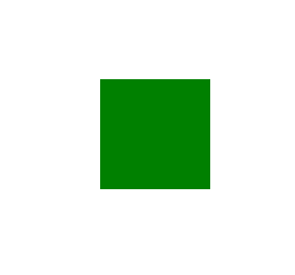
#square_shape {
                width: 100px;
                height: 100px;
                background: green;
            }
Rectangular Shape

#rectangle_shape {
                width: 200px;
                height: 100px;
                background: green;
            }
Round Shape
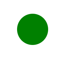
#circle_shape {
                width: 100px; height: 100px;
                background: green;
                border-radius: 50px;
                -moz-border-radius: 50px;
                -webkit-border-radius: 50px;
            }
Oval Shape
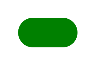
#oval_shape {
                width: 200px; height: 100px;
                background: green;
                border-radius: 50px;
                -moz-border-radius: 50px;
                -webkit-border-radius: 50px;
            }
Triangle Shape
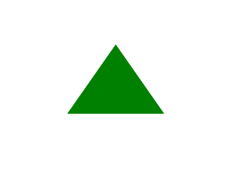
#triangle_up_shape {
                border-right: 70px solid transparent;
                border-bottom: 100px solid green;
                border-left: 70px solid transparent;
                width: 0; height: 0;
            }
Triangle Down Shape
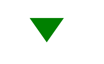
#triangle_down_shape {
                border-left: 70px solid transparent;
                border-top: 100px solid green;
                width: 0; height: 0;
                border-right: 70px solid transparent;
            }
Left-pointing triangle Shape
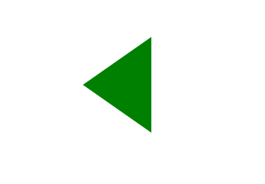
#triangle-left_shape {
                border-right: 100px solid green;
                border-top: 70px solid transparent;
                border-bottom: 70px solid transparent;
                width: 0; height: 0;
            }
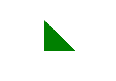
Right-pointing triangle Shape
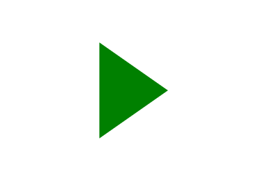
#triangle-right_shape {
                width: 0; height: 0;
                border-top: 70px solid transparent;
                border-bottom: 70px solid transparent;
                border-left: 100px solid green;
            }
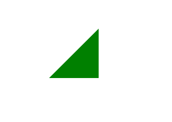
Up-left triangle Shape
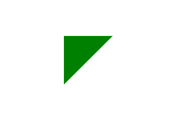
#triangle-topleft_shape {
                width: 0; height: 0;
                border-right: 100px solid transparent;
                border-top: 100px solid green;
            }
Up-right triangle Shape
#triangle-topright_shape {
                border-top: 100px solid green;
                border-left: 100px solid transparent;
                width: 0; height: 0;
            }
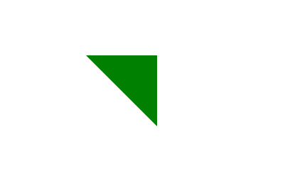
Lower-left triangle Shape
 #triangle-bottomleft_shape {
                border-bottom: 100px solid green;
                border-right: 100px solid transparent;
                width: 0; height: 0;
            }
Lower-right-pointing triangle Shape
#triangle-bottomright_shape {
                width: 0; height: 0;
                border-bottom: 100px solid green;
                border-left: 100px solid transparent;
            }
Tropisium Shape
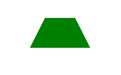
#trapezoid_shape {
                width: 100px; height: 0;
                border-right: 50px solid transparent;
                border-bottom: 100px solid green;
                border-left: 50px solid transparent;
            }
Parallel Shape
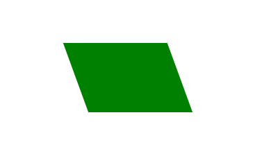
#parallelogram_shape {
                -webkit-transform: skew(20deg);
                -moz-transform: skew(20deg);
                -o-transform: skew(20deg);
                background: green;
                width: 150px; height: 100px;
            }
Octagon Shape

#octagon_shape {
                width: 100px; height: 100px;
                background: green;
                position: relative;
            }
            #octagon_shape:before {
                width: 42px; height: 0;
                content: "";
                position: absolute;
                top: 0; left: 0;
                border-bottom: 29px solid green;
                border-left: 29px solid #eee;
                border-right: 29px solid #eee;
            } #octagon_shape:after {
                width: 42px; height: 0;
                content: "";
                position: absolute;
                bottom: 0; left: 0;
                border-top: 29px solid green;
                border-left: 29px solid #eee;
                border-right: 29px solid #eee;
            }
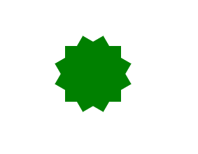
Star Shape
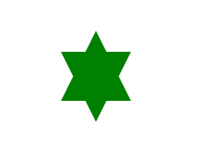
#star-six_shape {
                position: relative;
                border-bottom: 100px solid green;
                border-left: 50px solid transparent;
                border-right: 50px solid transparent;
                width: 0; height: 0;
            } #star-six_shape:after {
                border-left: 50px solid transparent;
                border-right: 50px solid transparent;
                border-top: 100px solid green;
                position: absolute;
                content: "";
                top: 30px;
                left: -50px;
                width: 0; height: 0;
            }
Star Five Corners Shape
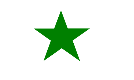
#star-five_shape {
                margin: 50px 0;
                position: relative;
                display: block;
                color: green;
                width: 0px; height: 0px;
                border-right: 100px solid transparent;
                border-bottom: 70px solid green;
                border-left: 100px solid transparent;
                -moz-transform: rotate(35deg);
                -webkit-transform: rotate(35deg);
                -ms-transform: rotate(35deg);
                -o-transform: rotate(35deg);
            } #star-five_shape:before {
                border-bottom: 80px solid green;
                border-left: 30px solid transparent;
                border-right: 30px solid transparent;
                position: absolute;
                height: 0; width: 0;
                top: -45px;
                left: -65px;
                display: block;
                content: '';
                -webkit-transform: rotate(-35deg);
                -moz-transform: rotate(-35deg);
                -ms-transform: rotate(-35deg);
                -o-transform: rotate(-35deg);
            } #star-five_shape:after {
                position: absolute;
                display: block;
                color: green;
                top: 3px;
                left: -105px;
                width: 0px; height: 0px;
                border-right: 100px solid transparent;
                border-bottom: 70px solid green;
                border-left: 100px solid transparent;
                -webkit-transform: rotate(-70deg);
                -moz-transform: rotate(-70deg);
                -ms-transform: rotate(-70deg);
                -o-transform: rotate(-70deg);
                content: '';
            }
Speech Bubble Shape
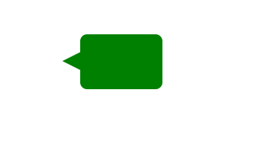
#talkbubble_shape {
                width: 120px; height: 80px;
                border-radius: 10px;
                background: green;
                position: relative;
                -moz-border-radius: 10px;
                -webkit-border-radius: 10px;
            } #talkbubble_shape:before {
                content:"";
                position: absolute;
                right: 100%;
                top: 26px;
                width: 0; height: 0;
                border-top: 13px solid transparent;
                border-right: 26px solid green;
                border-bottom: 13px solid transparent;
            }
Space Invader Shape
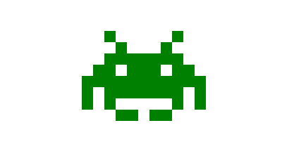
#space-invader_shape{
                box-shadow: 0 0 0 1em green, 0 1em 0 1em green, -2.5em 1.5em 0 .5em green, 2.5em 1.5em 0 .5em green, -3em -3em 0 0 green, 3em -3em 0 0 green, -2em -2em 0 0 green, 2em -2em 0 0 green, -3em -1em 0 0 green, -2em -1em 0 0 green, 2em -1em 0 0 green, 3em -1em 0 0 green, -4em 0 0 0 green, -3em 0 0 0 green, 3em 0 0 0 green, 4em 0 0 0 green, -5em 1em 0 0 green, -4em 1em 0 0 green, 4em 1em 0 0 green, 5em 1em 0 0 green, -5em 2em 0 0 green, 5em 2em 0 0 green, -5em 3em 0 0 green, -3em 3em 0 0 green, 3em 3em 0 0 green, 5em 3em 0 0 green, -2em 4em 0 0 green, -1em 4em 0 0 green, 1em 4em 0 0 green, 2em 4em 0 0 green; background: green; width: 1em; height: 1em; overflow: hidden; margin: 50px 0 70px 65px;
            }
Star 8 Angle Shape
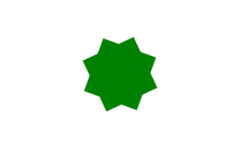
#burst-8_shape {
                background: green;
                width: 80px; height: 80px;
                position: relative;
                text-align: center;
                -webkit-transform: rotate(20deg);
                -moz-transform: rotate(20deg);
                -ms-transform: rotate(20deg);
                -o-transform: rotate(20eg);
            } #burst-8_shape:before {
                content: "";
                position: absolute;
                top: 0; left: 0;
                height: 80px; width: 80px;
                background: green;
                -webkit-transform: rotate(135deg);
                -moz-transform: rotate(135deg);
                -ms-transform: rotate(135deg);
                -o-transform: rotate(135deg);
            }
Packman Shape
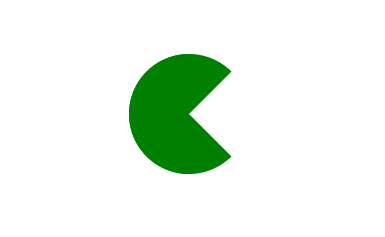
#pacman_shape {
                width: 0px; height: 0px;
                border-right: 60px solid transparent;
                border-top: 60px solid green;
                border-left: 60px solid green;
                border-bottom: 60px solid green;
                border-top-left-radius: 60px;
                border-top-right-radius: 60px;
                border-bottom-left-radius: 60px;
                border-bottom-right-radius: 60px;
            }
Greasy glass Shape

#magnifying-glass_shape {
                font-size: 10em;
                display: inline-block;
                width: 0.4em; height: 0.4em;
                border: 0.1em solid green;
                position: relative;
                border-radius: 0.35em;
            }#magnifying-glass_shape::before {
                content: "";
                display: inline-block;
                position: absolute;
                right: -0.25em;
                bottom: -0.1em;
                border-width: 0;
                background: green;
                width: 0.35em; height: 0.08em;
                -webkit-transform: rotate(45deg);
                -moz-transform: rotate(45deg);
                -ms-transform: rotate(45deg);
                -o-transform: rotate(45deg);
            }
Infinity Shape
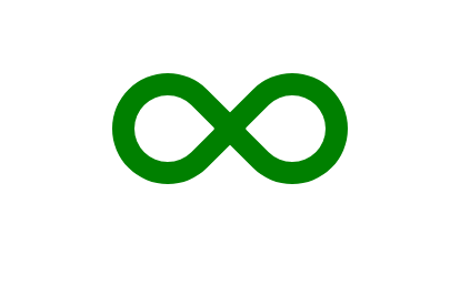
#infinity_shape {
                position: relative;
                width: 212px; height: 100px;
            } #infinity_shape:before, #infinity_shape:after {
                content: "";
                position: absolute;
                top: 0; left: 0;
                width: 60px; height: 60px;
                border: 20px solid green;
                -moz-border-radius: 50px 50px 0 50px;
                border-radius: 50px 50px 0 50px;
                -webkit-transform: rotate(-45deg);
                -moz-transform: rotate(-45deg);
                -ms-transform: rotate(-45deg);
                -o-transform: rotate(-45deg);
                transform: rotate(-45deg);
            } #infinity_shape:after {
                left: auto; right: 0;
                -moz-border-radius: 50px 50px 50px 0;
                border-radius: 50px 50px 50px 0;
                -webkit-transform: rotate(45deg);
                -moz-transform: rotate(45deg);
                -ms-transform: rotate(45deg);
                -o-transform: rotate(45deg);
                transform: rotate(45deg);
            }
Hexagon Shape
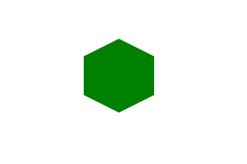
#hexagon_shape {
                width: 100px; height: 55px;
                background: green;
                position: relative;
            } #hexagon_shape:before {
                content: "";
                position: absolute;
                top: -25px; left: 0;
                width: 0; height: 0;
                border-left: 50px solid transparent;
                border-right: 50px solid transparent;
                border-bottom: 25px solid green;
            } #hexagon_shape:after {
                content: "";
                position: absolute;
                bottom: -25px;
                left: 0;
                width: 0; height: 0;
                border-left: 50px solid transparent;
                border-right: 50px solid transparent;
                border-top: 25px solid green;
            }
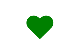
Heart Shape

#heart_shape {
                position: relative;
                width: 100px; height: 90px;
            } #heart_shape:before, #heart_shape:after {
                position: absolute;
                content: "";
                left: 50px; top: 0;
                width: 50px; height: 80px;
                background: green;
                -moz-border-radius: 50px 50px 0 0;
                border-radius: 50px 50px 0 0;
                -webkit-transform: rotate(-45deg);
                -moz-transform: rotate(-45deg);
                -ms-transform: rotate(-45deg);
                -o-transform: rotate(-45deg);
                transform: rotate(-45deg);
                -webkit-transform-origin: 0 100%;
                -moz-transform-origin: 0 100%;
                -ms-transform-origin: 0 100%;
                -o-transform-origin: 0 100%;
                transform-origin: 0 100%;
            } #heart_shape:after {
                left: 0;
                -webkit-transform: rotate(45deg);
                -moz-transform: rotate(45deg);
                -ms-transform: rotate(45deg);
                -o-transform: rotate(45deg);
                transform: rotate(45deg);
                -webkit-transform-origin: 100% 100%;
                -moz-transform-origin: 100% 100%;
                -ms-transform-origin: 100% 100%;
                -o-transform-origin: 100% 100%;
                transform-origin :100% 100%;
            }
Egg Shape
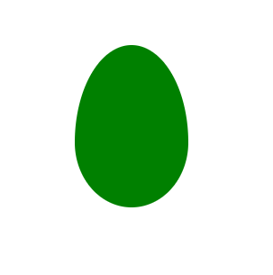
#egg_shape {
                display:block;
                width: 126px; height: 180px;
                background-color: green;
                -webkit-border-radius: 63px 63px 63px 63px / 108px 108px 72px 72px;
                border-radius: 50% 50% 50% 50% / 60% 60% 40% 40%;
            }
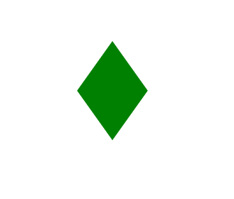
Diamond Shape
#diamond-shield_shape {
                width: 0; height: 0;
                border: 50px solid transparent;
                border-bottom: 20px solid green;
                position: relative;
                top: -50px;
            } #diamond-shield_shape:after {
                content: '';
                position: absolute;
                left: -50px;
                top: 20px;
                width: 0; height: 0;
                border: 50px solid transparent;
                border-top: 70px solid green;
            }
Square diamond Shape
#diamond-narrow_shape {
                width: 0; height: 0;
                border: 50px solid transparent;
                border-bottom: 70px solid green;
                position: relative; top: -50px;
            } #diamond-narrow_shape:after {
                content: '';
                position: absolute;
                left: -50px;
                top: 70px;
                width: 0; height: 0;
                border: 50px solid transparent;
                border-top: 70px solid green;
            }
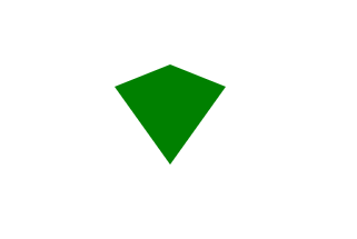
The Pentagon Shape
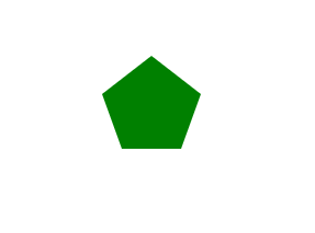
#pentagon_shape {
                position: relative;
                width: 54px;
                border-width: 50px 18px 0;
                border-style: solid;
                border-color: green transparent;
            } #pentagon_shape:before {
                content: "";
                position: absolute;
                height: 0; width: 0;
                top: -85px; left: -18px;
                border-width: 0 45px 35px;
                border-style: solid;
                border-color: transparent transparent green;
            }
Cut diamond Shape
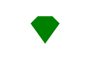
#cut-diamond_shape {
                border-color: transparent transparent green transparent;
                border-width: 0 25px 25px 25px;
                border-style: solid;
                height: 0; width: 50px;
                position: relative;
                margin: 20px 0 50px 0;
            } #cut-diamond_shape:after {
                content: "";
                position: absolute;
                top: 25px; left: -25px;
                width: 0; height: 0;
                border-style: solid;
                border-color: green transparent transparent transparent;
                border-width: 70px 50px 0 50px;
            }
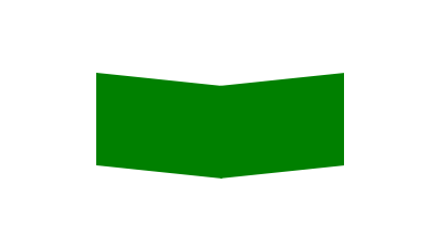
V shape
#chevron_shape {
                position: relative;
                text-align: center;
                padding: 12px;
                margin-bottom: 6px;
                height: 60px; width: 200px;
            } #chevron_shape:before {
                content: '';
                position: absolute;
                top: 0; left: 0;
                height: 100%; width: 51%;
                background: green;
                -webkit-transform: skew(0deg, 6deg);
                -moz-transform: skew(0deg, 6deg);
                -ms-transform: skew(0deg, 6deg);
                -o-transform: skew(0deg, 6deg);
                transform: skew(0deg, 6deg);
            } #chevron_shape:after {
                content: '';
                position: absolute;
                top: 0; right: 0;
                height: 100%; width: 50%;
                background: green;
                -webkit-transform: skew(0deg, -6deg);
                -moz-transform: skew(0deg, -6deg);
                -ms-transform: skew(0deg, -6deg);
                -o-transform: skew(0deg, -6deg);
                transform: skew(0deg, -6deg);
            }
12 Angle Star Shape
#burst-12_shape {
                background: green;
                width: 80px; height: 80px;
                position: relative;
                text-align: center;
            } #burst-12_shape:before, #burst-12_shape:after {
                content: "";
                position: absolute;
                top: 0; left: 0;
                height: 80px; width: 80px;
                background: green;
            } #burst-12_shape:before {
                -webkit-transform: rotate(30deg);
                -moz-transform: rotate(30deg);
                -ms-transform: rotate(30deg);
                -o-transform: rotate(30deg);
            } #burst-12_shape:after {
                -webkit-transform: rotate(60deg);
                -moz-transform: rotate(60deg);
                -ms-transform: rotate(60deg);
                -o-transform: rotate(60deg);
            }
In Young Shape
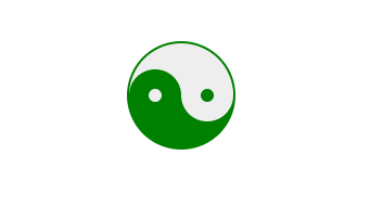
#yin-yang_shape {
                width: 96px; height: 48px;
                background: #eee;
                border-color: green;
                border-style: solid;
                border-width: 2px 2px 50px 2px;
                border-radius: 100%;
                position: relative;
            } #yin-yang_shape:before {
                content: "";
                position: absolute;
                top: 50%; left: 0;
                background: #eee;
                border: 18px solid green;
                border-radius: 100%;
                width: 12px; height: 12px;
            } #yin-yang_shape:after {
                content: "";
                position: absolute;
                top: 50%; left: 50%;
                background: green;
                border: 18px solid #eee;
                border-radius:100%;
                width: 12px; height: 12px;
            }
Television Shape
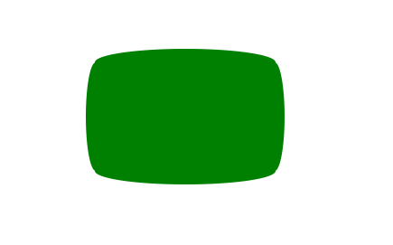
#tv_shape {
                position: relative;
                width: 200px; height: 150px;
                margin: 20px 0;
                background: green; border-radius: 50% / 10%;
                color: white;
                text-align: center;
                text-indent: .1em;
            } #tv_shape:before {
                content: '';
                position: absolute;
                top: 10%; bottom: 10%; right: -5%; left: -5%;
                background: inherit;
                border-radius: 5% / 50%;
            }
Curved Arrow Shape
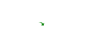
#curvedarrow_shape {
                position: relative;
                width: 0; height: 0;
                border-top: 9px solid transparent;
                border-right: 9px solid green;
                -webkit-transform: rotate(10deg);
                -moz-transform: rotate(10deg);
                -ms-transform: rotate(10deg);
                -o-transform: rotate(10deg);
            } #curvedarrow_shape:after {
                content: "";
                position: absolute;
                border: 0 solid transparent;
                border-top: 3px solid green;
                border-radius: 20px 0 0 0;
                top: -12px; left: -9px;
                width: 12px; height: 12px;
                -webkit-transform: rotate(45deg);
                -moz-transform: rotate(45deg);
                -ms-transform: rotate(45deg);
                -o-transform: rotate(45deg);
            }
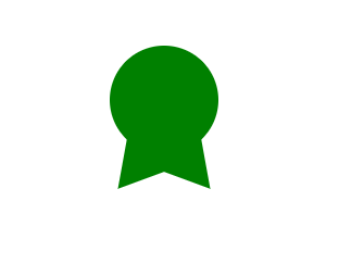
Badge Ribbon Shape
#badge_ribbon_shape {
                position: relative;
                background: green;
                height: 100px; width: 100px;
                -moz-border-radius: 50px;
                -webkit-border-radius: 50px;
                border-radius: 50px;
            }#badge_ribbon_shape:before, #badge_ribbon_shape:after {
                content: '';
                position: absolute;
                border-bottom: 70px solid green;
                border-left: 40px solid transparent;
                border-right: 40px solid transparent;
                top: 70px; left: -10px;
                -webkit-transform: rotate(-140deg);
                -moz-transform: rotate(-140deg);
                -ms-transform: rotate(-140deg);
                -o-transform: rotate(-140deg);
            } #badge_ribbon_shape:after {
                left: auto; right: -10px;
                -webkit-transform: rotate(140deg);
                -moz-transform: rotate(140deg);
                -ms-transform: rotate(140deg);
                -o-transform: rotate(140deg);
            }
That's all todoy.Everybody stays well and let me know how was this Post.


Leave a Comment