One of the most confusing things in web design is the setting of CSS font size while making a professional template. There is no web designer that does not have problems with this issue or is not confused. There are 5 types of units presenting the font size to use for web design. These are - px, pt,% (percent), em and rem. The measurement of these 5 types of units is different. Their working style is also different.
However, debate over which unit is more useful or better than working than any other unit, is so controversial that it is difficult to decide which unit to pick. According to different designers, defferent units are more effective according to work type. Before choosing this, you should better to know using all the units, methods of operation and the advantages and disadvantages of those units. But in this case, note that instead of choosing this kind of unit that you like to use, use the type of units that will create less errors.

So let's know about the current 5 units
5 units of font size :
px (pixel unit):
This is a typical one unit, especially for web design. Those who work on converting from the design to the Web, there is no pairing to make the design pixel perfect. But this unit has a big problem that very few designers have noticed. But the problem seems to be very apparent to me at least. The problem is -
Everybody knows that almost all the tabs of this day or more of this kind of device are in Wide 1024 pixels or in some cases even more. But we know 1024 pixels that the resolution of the desktop's small monitor. Now it's a fact that 1024 pixel desktop monitor is 14 inches where the display size of many tabs is 6 inches. So it is clear that 1024 pixel must show on 6 inches monitor.That means less than half size display for same resolution. Now imagine if a 12-pixel text works well in a 14-inch monitor, it also can be seen in a 6-inch small display. If not yet understand, browse the same design in two monitors, then you can understand it.
So if you need to use pixel units to perfect your design or for any other reason, then take a look at this issue. Take a look at the size of the font in the big monitor, it is not a problem to see it on small devices. If possible, use fonts that can be replaced by fonts that can be seen as visible as small. And the rule of using this font size unit is as follows
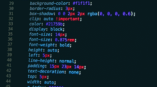
font-size: 14px;
pt (point unit):
This is more popular in print media. 1 point is 1 in 72 percent of 1 inch. The calculation of the pt(Point Unit) seems likely as px(Pixel Unit). But the difference from pixels is that by using this unit you can measure with scale but not in pixels. This means that you can not measure the number of pixels that you print in a pixel. The problem with which I'm talking about pixels on Tab's screen is also in this case. The use of this unit is as follows
font-size: 14PT;
percent (%) (percentage unit):
It is possible to use the Percent Unit which used to be a tab or small device for px and pt. For any device, the root font has a default size. Suppose if a larger screen size of 1024 pixels is font-size: 100% means 12 pixels, but for smaller devices it is usually more. That is, in that case font-size: 100% may be 14 pixels. Then there is no problem with tabs in this case. But it is not usual to calculate by default value. It also uses a sub element in relation to its parent element. It means, if you give a font size of 120 for ul elements, it might be 120% but it will probably be 14.4 pixels. But if there is a ul li in it, its font size will be 17.28 pixels, and if there is another ul in it, its font size will be 20.74 pixels. How? The first ul was 120%, now if 100% is equal to 12 px then 120% = 1.2 * 12px = 14.4px. In the case of the next ul, it will be compared to its parent element, rather than the original font. This means that the font size of the parent is 14.4px, so the font size will be 14.4 * 1.2 = 17.28px, so again 17.28 * 1.2 = 20.74px; So it is possible, it has limitations too. However, this should be used in this way:
FONT-SIZE: 120%;
em (em unit):
EM is a popular unit for using the web. This is mostly used. Its type of work is very similar to Percent. 1 em = current font size. It's means, there is a problem with sub-element as like Percent(%) unit. Yet the EM has become quite popular. There was no doubt about its popularity if there is no rem unit of font size. Its use is as follows:
FONT-SIZE: 1EM;
rem (REM unit):
Personally say it's my favorite unit. Because it solves all my problems. Although sometimes I use rem and em mix in font. Its unit system is like em and %. The only difference is that it always corresponds to the root font size. That means 100% of device or browser = 1rem . After the arrival of rem unit the parent and child problem has been solved. Although many designers are not yet aware of this unit. rem unit is like font-size:
FONT-SIZE: 1REM;
So if you read this post, you can understand that using a font size unit is more reasonable or which is good for you. Hopefully the post will help you in your web design career. If you have any question, comment below.


Leave a Comment